Abstract
As contemporary buildings increasingly use glass as a significant cladding material, architectural designers are focusing more on the aesthetic qualities of glass. While transparency was, and remains, the dominant attribute for most projects, many designs now use a more complete materiality palette encompassing reflectivity, color, and surface materiality.
These aesthetic goals must be combined with sometimes-competing performance requirements (strength, impermeability, solar protection, thermal isolation, acoustic attenuation, and durability) and manufacturing capabilities.
In this paper, six case studies of recent projects are presented that exhibit qualities of transparency, reflectivity, color, and surface materiality, including design and fabrication challenges of meeting designers’ and owners’ expectations for their projects.
- National Museum of African American History and Culture
- 150 Greenwich, 4 World Trade Center
- The United Nations Secretariat Façade Replacement
- Barnard College Diana Center
- The Dutchess County Residence
- Reflections at Keppel Bay
Introduction
As contemporary buildings increasingly use glass as a significant cladding material, architectural designers are focusing more on the aesthetic qualities of glass.
While transparency was, and remains, the dominant attribute for most projects, many designs now use a more complete glass materiality palette encompassing reflectivity, color, and variation of surface.
In the realization of glass facades, these aesthetic goals are influenced by both the performance requirements of the glass and contemporary manufacturing capabilities for small and large-scale production.
The following selection of projects are prime examples of designers expressing the architectural design of their projects by exploring the materiality of glass, while meeting engineering requirements and working within manufacturing limitations.
Transparency
At the National Museum of African American History and Culture, Freelon Adjaye Bond/ SmithGroup designed the building to be wrapped by a monumental exterior screen in the form of a crown or corona, a reference to a traditional Yoruban column capital.
The three tiers express faith, hope, and resiliency, and the inclined 17-degree angle is a direct reference to the capstone of the adjacent Washington Monument.
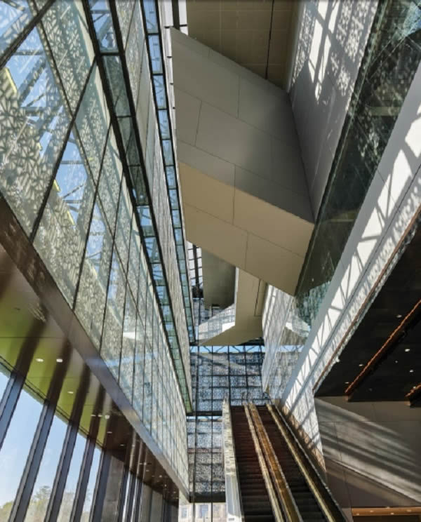
A steel truss system supports both the Corona’s exterior screen and interior glass from the zone in between these two layers. Upon entering the museum, a visitor sees a smooth, uninterrupted plane of glass, zig-zagging upward. The full height of the Corona is experienced through an atrium space on all four sides [Figure 3]. Glass sizes and structural modules were optimized to maximize the overall transparency.
The glass enclosure inboard of the Corona screen uses transparency to facilitate views, both from outside to inside, and from inside to outside. Solar shading of the allglass envelope is accomplished through multiple measures.
The Corona screen shades the glass façade, providing an initial reduction of solar heat gain and helping to avoid uncomfortable glare conditions. Next, the clear insulating glass units, framed in curtain wall units, incorporate a high-visiblelight-transmittance, low-e coating, and a PVB laminate that filters out nearly all the unwanted ultraviolet light.
Lastly, two densities of dot-pattern ceramic frit are incorporated. The horizontal skylights carry a denser frit pattern as they are not shaded by the Corona and receive a greater portion of the incident solar radiation.
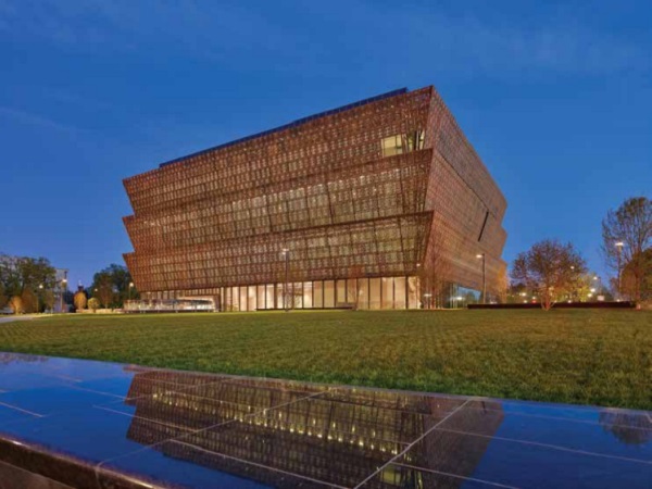
A lighter density of dot-pattern ceramic frit to the sloped glass inboard of the Corona. This frit helps the lighting in the zone between Corona screen and glass to achieve a soft glow at night, appropriate for the National Mall. The result is a uniform wash of light which highlights the texture of the screen’s perforations.
The first floor and at the “lenses” the glass is designed for maximum transparency to invite visitors in and highlight views out. Here, the insulating glass is low-iron and larger in size. The transparent glass appears dark when viewed frontally from the exterior during the day because the light level outside is on the order of 400 times brighter than inside the building [Figure 1].
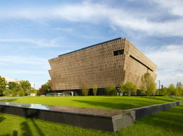
This effect occurs on any similar “transparent” glass installation. However, in the early evening when the light levels inside and outside are more balanced, light from the interior of the museum spills out onto the mall and through the Corona [Figure 2].
Once inside, the situation is reversed. The glass appears most transparent during the day looking out onto the bright mall as shadows from truss components and screens enliven the gallery’s walls [Figure 3].
Reflectivity
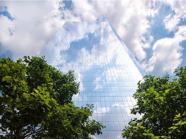
While the reflective glass high-rise tower typology has proliferated around the globe, especially in hot climates where solar protection is critical, rarely has the reflectivity of glass been used with as much architectural impact as at 4 World Trade Center.
Fumihiko Maki’s minimalist design combines two interlocking prisms, and orients a shear planar façade rising 978 feet (298 meters) above the 9/11 Memorial Plaza and the footprints of the former World Trade Center buildings.
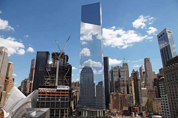
While several different glass treatments were studied during the initial glass selection process, including ideas of muting the reflection with a subtle #1 surface frit, the final design direction was to optimize reflectivity: enough to mask the difference between vison and spandrel while providing sufficient visible light.
A high performance, low-e coating was selected for its high reflectivity level of 46% with minimal coloration, and it was combined with low-iron glass so that the body tint of the glass would not affect the color of the reflections (note that the reflected light passes through the outer lite two times making the neutral tint of the glass critical).
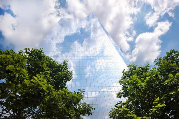
The aluminum frame curtain wall units removed all unnecessary glass joints with floor to floor modulation, eliminating all extraneous geometry to accentuate the flat plane of the façade. The final effect is the dematerialization of the massive building by making it most apparent as reflection.
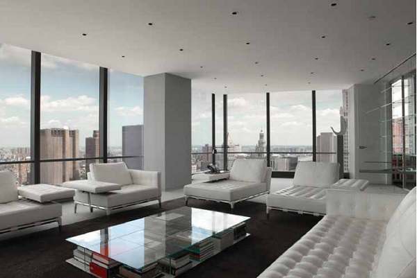
In many daytime lighting conditions, the 61-story tower blends into the sky and its urban context, while the 35% visible light transmittance of the glass creates a comfortable interior lighting level.
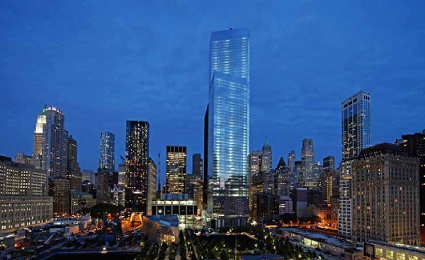
After the sun sets, a soft glow can be seen through the glass, but the reflections of adjacent buildings and the darkened sky remain the dominant appearance of the building itself.
Color
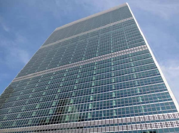
The United Nations Headquarters in New York City was designed in 1947 by a collaborative group of architects, including Le Corbusier, Wallace K. Harrison, and Oscar Niemeyer, among others. The iconic International Style, 17-acre campus is composed of six buildings, with the tower form of the Secretariat rising above the nearby East River.
The original Secretariat façade was revolutionary for its time, with interlocking unitized frames installed sequentially up the façade.
Once the steel and aluminum units were in place, double-hung window sashes with heat absorbing blue-green PPG Solex® glass were installed in the vision area, and Aklo® heat absorbing blue-green, rolled, wire glass was installed at the spandrels in front of a black painted concrete masonry unit wall.
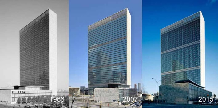
The overall effect was a lattice of metal with horizontal bands of transparent glass at the vision areas and slightly darker glass at the spandrels. Unfortunately, the glass tint was not sufficient to limit solar heat gain and glare, so soon after completion a reflective film was added to the east elevation, and years later to the west elevation.
The unintended consequence was the loss of the designers’ original intent of a transparent façade [Figure 8, 2007]. After many years of weathering, the UN undertook a complete campus renovation in 2006. Heintges & Associates was hired as both Design Architect and Specialist Consultant, tasked with restoring the integrity of the façades for all six of the campus buildings.
For the Secretariat, extensive onsite testing proved that the wall was not repairable, and the UN moved forward with a replacement strategy that was faithful to the historic design intent, but upgraded to meet modern standards for performance, security, and sustainability.
At the beginning of the design phases, the project team identified glass selection as critical to the success of the project: the challenge was to match the historic appearance of the original 6mm monolithic glass with a much thicker laminated insulating glass unit that would provide for improved performance, daylight comfort, solar heat gain control, thermal isolation, and security.
Physical samples of over 25 combinations of clear, low-iron, and tinted substrates with highperformance low-e coatings were compared to the appearance of the historic vision and spandrel glass [Figure 9].
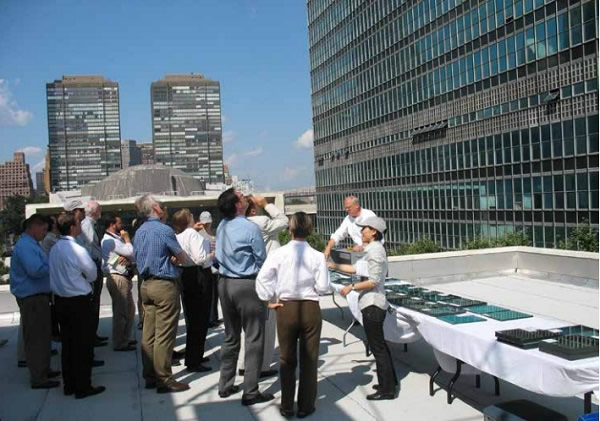
Samples were monitored on the roof of the adjacent Library Building over several weeks with varying sky dome conditions, sun angles, and times of day, with concerns of color match, reflectance color shift, polarizing effects, etc., eliminating many of the products.
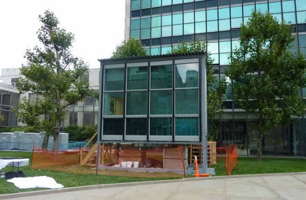
From these, a full-scale mockup was set-up on the campus to review the best three options for the vision glass, and a single type of laminated blue-green spandrel glass that matched the coloration and visible light transmittance of the original spandrel glass set in front of three different back pan colors.
For comparison, the visual mockup also included simulations of the original monolithic vision and spandrel glass. Interior blinds and proposed lighting fixtures were also included, allowing the glass to be viewed in multiple lighting and shading conditions [Figure 10].
Based on the observations of color, reflectivity, and transmittance, a 33mm thick insulating glass unit with a tinted blue-green outer lite, high performance triple-silver low-e coating, and low-iron laminated inner lite was selected for the vision area.
Visually it was the best match when compared to the simulated original, and it offered the best performance with an energy efficient solar heat gain coefficient of 0.24 and a comfortable interior light level with visible light transmittance of 51%.
The spandrel glass selection proved more difficult, and was a further illustration of the importance of color and the effect of reflection on our perception of the glass color. At the visual mockup, the façade contractor proposed a modification to include insulating glass at the spandrels to reduce risk of condensation within the shadowbox cavity.
A clear inner lite was added to the specified composition of two different blue-green tinted substrates to replicate the tint of the original spandrel glass. Unfortunately, the clear inner lite increased the reflectivity of the overall glass composition from 6.1% to 9.2%, an increase of 50% more reflectivity. While this was not visible at the visual mockup due to the low viewing angle, it became readily apparent at the performance mock-up [Figure 11].
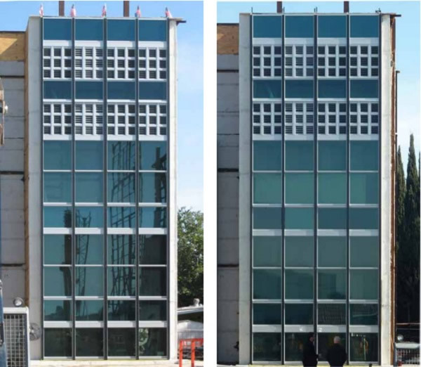
The increased reflectivity caused the spandrel zone to read as brighter than the vision glass, an inversion of the original intent of a dark spandrel zone separating transparent vision areas. Fifteen additional alternates were developed with various combinations of frits, low-e coatings and tinted substrates, and four were finally selected for review on the performance mockup.
The successful solution incorporated a grey inner lite with a thermal low-e coating that further reduced reflection off the inner lite and a total reflectance level of 7.0%, meeting both the design intent of historically accurate color and the project performance requirements [Figure 12].
The final result of the glass selection process was the replacement of the façade in a manner faithful to the original design intent of transparent tinted vision glass and relatively darker bands of spandrel glass [Figure13].
Surface Materiality
While transparency, reflectivity, and color are material properties of glass, none of them express the material surface of the glass architecturally. By etching the outermost surface of the glass, adding an opaque frit pattern, or other processes, architects materialize the glass surface itself as part of the architecture.
The last three projects will explore three ways this has been achieved. Weiss/Manfredi Architects designed a sevenstory mixed-use building and student center to replace Barnard College’s two-story McIntosh Center.
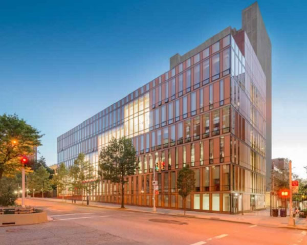
A skeptical board of trustees, partial to the conventional brick-and-mortar buildings of the campus, was persuaded by an all-glass facade design that references the aesthetic red brick with glass that is essentially perceived as a masonry material.
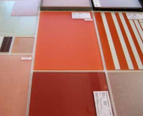
Extensive samples and mock-ups tested the color of the façade’s glass in various light conditions [Figures 15 and 16].
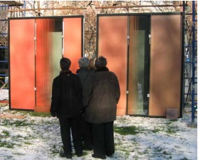
The result is a unitized system of transparent, fritted, and translucent glass over colored back panels.
The acid-etched #1 surface evokes the look of opaque masonry while still reflecting light; the building’s distinct color is created by a pale terra cotta-colored frit on the #2 surface, a bright red-painted back panel inboard, and bronze-colored aluminum panels at floor lines.
Glass is structurally glazed into a bronzecolored aluminum frame, creating a warm effect that varies throughout the day and seasons.
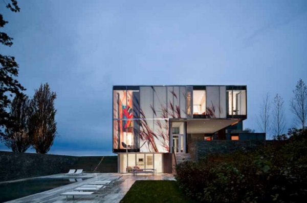
On the eastern slopes of the Hudson River Valley, Allied Works Architecture designed a residence, guesthouse, and private gallery on a 400-acre property in Dutchess County, New York. The helical structure of the Main House is enclosed by a skin of transparent, translucent, and opaque panels that let views and natural light into the space while helping to protect an extensive art collection within.
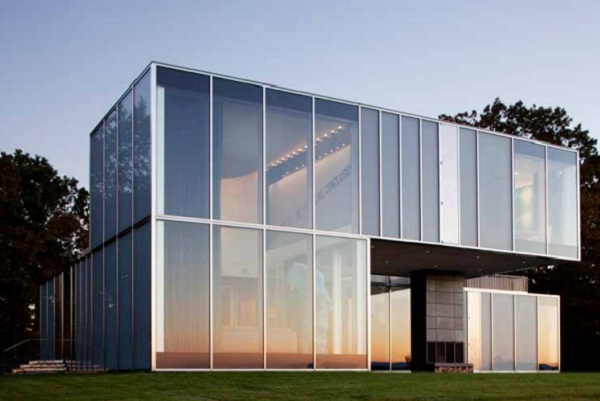
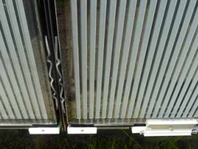
The entire façade is composed of glass panels, some as transparent walls and openings that give striking views of the landscape to those inside, others as opaque cladding to conceal structural elements or interior walls for hanging art.
The opaque panels are deeply carved and then acid-etched with vertical stripes, redefining them as surface [Figure 18].
When darkness falls, the etched glass becomes a canvas for “Light House,” a sitespecific video installation by Doug Aitken that uses 360-degree projection to illuminate the glass with striking images of nature that make it pop from its surroundings, or almost camouflage it altogether on the landscape [Figure 19].
Reflections at Keppel Bay, located on the shoreline of Singapore’s Keppel Harbor, consists of six curved residential towers ranging in height from 395 feet (120 meters) to 575 feet (175 meters). Studio Daniel Libeskind gathered the various buildings together to create an airy composition in glass and aluminum that is different from every angle.
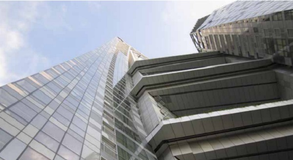
Since the forms of the towers were independent from the residential layout on the interior, it was important to the designers to blend out the regular vision glass areas with the grid of spandrel areas. A concept of pixilation was developed, requiring two distinct types of spandrel glass that would look different under any viewing angle.
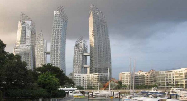
Since nearly all glass looks similar at very oblique angles due to the uniform surface, this required one type to have a surface treatment on the outermost face of the glass. A full-scale visual mockup was erected on a nearby site to review 20 different options for the two needed spandrel glass types [Figure 21].
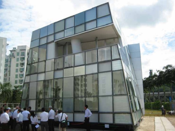
The eventual solution was a simple inversion: one type would be a true acid etch on the #1 surface, with a mirrored low-e coating on the innermost surface; and a second type that consisted of a “simulated acid etch” ceramic frit (translucent white) facing a laminate, and the same mirrored low-e coating on the innermost surface.
The matte reflection of the first type causes it to go “dark” in direct light conditions and oblique viewing angles, and “light” in more diffuse light and perpendicular angles when reflecting bright scenes.
The second type behaves just the opposite, looking “light” in direct light conditions and oblique viewing angles, and “dark” in diffuse light or in perpendicular viewing angles when reflecting bright areas.
The result is a dynamic reading of the façade that continuously changes its pixilation as one moves around the towers, blending the gridded façades into uniformly pixilated surfaces.
Glass Industry Development
Through careful selection, the architects and designers of the projects shown above have enhanced the architectural expression of their projects through the materiality of glass. To support these efforts, the glass industry will need to continue to develop current and future architectural glass products available on the market.
For transparency, reduce anisotropy from heat treatment (make online anisotropy measurement standard), continue to improve solar selectivity of high performance, low-e coatings, and reduce the cost of anti-reflective coatings. For reflectivity, improve glass flatness for heat treated glass (transition industry to milidiopter distortion measurement).
For surface, continue to develop other processes to modify the outer surface of the glass. And for all the material qualities, increase size capacity throughout the supply chain, especially during installation. With new tools and better quality at their disposal, façade designers will continue to push the architectural expressions of the materiality of glass.
Conclusion
Creative designers are pushing façades to new and unexpected directions. We have seen this at the National Museum of African American History and Culture where transparency of the glass was critical for accentuating the Corona.
At 4 World Trade Center, the expression of the glass as pure reflection enhanced the minimalist form, paying tribute to its memorial context. At the United Nations Secretariat, the original glass color was maintained and upgraded through a historically faithful replacement.
And at the Barnard College Diana Center, the Dutchess County Residence, and Reflections in Singapore, the #1 surface of the glass was transformed from the glossy reflectivity we have come to expect into a matte surface that can receive light.
Our view is that more and more projects are seeking to express the full range of glass materiality as the glass industry continues to develop and support these initiatives.
While transparency will likely continue as the dominant materiality to connect interior and exterior, reflectivity, color, and surface texture provide equally interesting areas of exploration for future projects.


