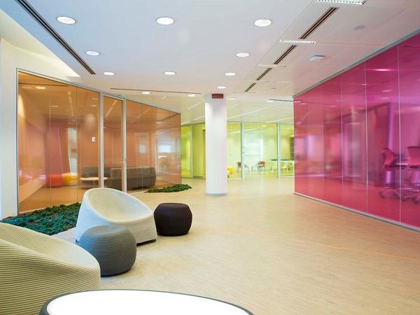
Today we are talking about COLORS in relation to a renovation or an ad hoc construction of a new glass furniture for offices. If it could seem a contradiction to say "glass" traditionally transparent and "colors", it is not like that at all! All the glass furniture designed by VetroIN is customizable, even in the colors.
Let's start with a fundamental premise: the environment in which we work and spend most of the time affects us, affects us in our performance. All architects and interior designers in recent years have certainly studied this aspect, changing or optimizing proposals and projects to ensure well-being and harmony to all workers.
Let's see together what are the most suitable colors, those neutral and also those to be avoided in the project of glass furniture for offices.
* THE WHITE: does not disturb, favors order and concentration but is very cold and not very welcoming;
* THE BROWN AND THE DARK COLORS: dominant shades that evoke authority and solidity (therefore perfect for managers) but create a very dark and heavy environment;
* THE GRAY: it is the color of attention, therefore perfect for precision work, despite arouses emotions of sadness and light melancholy.
* LIFELY COLORS: here we are in the colors of creativity, from the very exciting red to the energetic orange, from the bright yellow to the blue of a very relaxing nature to smooth out the stress.
As you can see, there are pros and cons for practically all colors. It is necessary to use them and match them to the best in order to have an effect that is not only aesthetically pleasing but also functional to the well-being of all occupants. Ask VetroIN a colorful and unique project of glass furniture for offices.

